
Lazy Loading and Responsive Images: A Practical Guide
Two simple techniques decide a lot about how fast images load: lazy loading, which delays images until they're needed, and responsive images, which give each device an image of the right size. Both are built into HTML, need no JavaScript, and work in every modern browser. This guide shows how they work and how to avoid the mistakes that cancel out their benefits. For the bigger picture, see How to optimize images for your website.
Lazy loading with loading="lazy"
By default, the browser downloads every image on a page as soon as it finds it, including images far down the page that the reader may never scroll to. Adding one attribute changes that:
<img src="photo.webp" alt="Description" width="800" height="600" loading="lazy">
With loading="lazy", the browser waits until the image is close to entering the viewport before downloading it. The first screen loads faster because it isn't competing with dozens of off-screen images, and visitors who leave early don't download images they never see.
The most common mistake
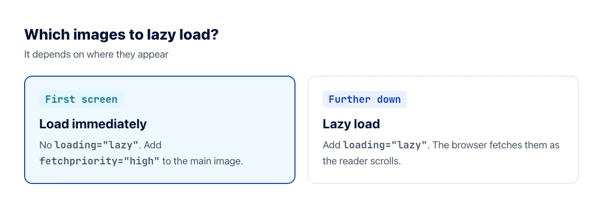
Don't lazy load images in the first screen, and above all not the main image. A lazy image is only requested after the browser has worked out the page layout, so lazy loading your hero image delays the most important thing on the page and makes your Largest Contentful Paint worse. Do the opposite for that image: tell the browser it matters.
<img src="hero.webp" alt="Description" width="1200" height="630" fetchpriority="high">
Responsive images with srcset and sizes
A single 1600-pixel image looks great on a large monitor, but a phone with a 400-pixel-wide screen downloads the whole thing and throws most of the pixels away. Responsive images let you offer several sizes and let the browser choose.
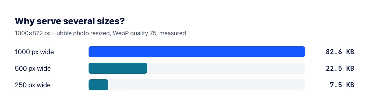
In our test, the same photo was 82.6 KB at 1000 pixels wide and just 22.5 KB at 500 pixels, so a phone that only needs the smaller version saves 73%. Here's how to offer both:
<img src="photo-1000.webp" srcset="photo-500.webp 500w, photo-1000.webp 1000w, photo-1600.webp 1600w" sizes="(max-width: 800px) 100vw, 800px" alt="Description" width="1000" height="872" loading="lazy">
srcsetlists the available files and their actual widths in pixels (thewunit).sizestells the browser how wide the image will be displayed. Here: the full viewport width on screens up to 800 pixels, otherwise 800 pixels.srcis the fallback for very old browsers.
The browser combines sizes with the screen's pixel density to pick the smallest file that will still look sharp. A phone with a 400-pixel-wide screen at 2× density needs about 800 pixels, so it picks the 1000-pixel file, not the 1600-pixel one.
How to create the sizes
If your CMS doesn't generate image sizes automatically (WordPress does, for example), create them yourself. Use the image resizer to save the same image at a few widths, such as 500, 1000 and 1600 pixels, then compress them to WebP. Three or four sizes are plenty for most layouts.
Art direction with the picture element
Sometimes you want a different image on small screens, not just a smaller one, such as a tighter crop of a wide banner. That's what <picture> is for:
<picture><source media="(max-width: 600px)" srcset="banner-square.webp"><img src="banner-wide.webp" alt="Description" width="1600" height="600"></picture>
The same element also lets you offer a modern format with a fallback, as described in What is AVIF?
Checklist
- Every image has
widthandheightattributes, so the layout doesn't jump. - Images below the first screen have
loading="lazy". - The main image in the first screen is not lazy and has
fetchpriority="high". - Large images offer several sizes via
srcset, with asizesvalue that matches your layout. - Each size is compressed, preferably as WebP.
- You've tested the page on a phone-sized screen and checked which file actually loaded.
Frequently asked questions
Do I still need a JavaScript lazy loading library?
Rarely. Native loading="lazy" works in all modern browsers. A library only makes sense for special effects, such as blurred placeholders, or for lazy loading CSS background images.
Does lazy loading hurt SEO?
Not when it's done with the native attribute. Google's crawler renders the page and sees lazy-loaded images. Problems only arise with scripts that never place the real image URL in the page.
What if I get sizes wrong?
The browser may pick a file that's larger than needed (wasting data) or smaller than needed (looking soft). Open your page at a few screen widths and check in your browser's developer tools which file was actually loaded.
Can I lazy load embedded videos and maps?
Yes. The same loading="lazy" attribute works on <iframe> elements, which is especially useful for embedded YouTube videos and maps further down a page, since each embed can pull in a large amount of script.
The bottom line
Prioritize the main image, lazy load the rest, and offer a few sizes with srcset and sizes. These few attributes mean every visitor downloads only the images they see, at the size their screen needs.