How to Optimize Images for Your Website: 6 Steps That Matter
On most websites, images make up the largest share of what visitors download. A product page with a few dozen unoptimized photos can weigh tens of megabytes, which means seconds of waiting on a phone, and many visitors leave before the page appears. The largest image near the top of the page also frequently determines your Largest Contentful Paint (LCP), one of the three Core Web Vitals Google uses to measure page experience.
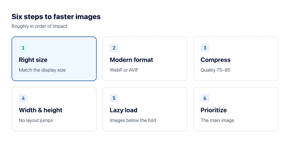
The good news: optimizing images doesn't require anything complicated. Here are six steps, roughly in order of how much they help.
1. Resize images to the size they're displayed at
This saves the most by far. A phone photo is around 4000 pixels wide, but the column it's displayed in is often 800–1200 pixels. Uploading the original forces every visitor to download many times more data than the page can show.
A simple rule: make the image about 1.5–2 times as wide as its display area (so it stays sharp on high-resolution screens), and no larger. In our test, halving a 1000-pixel photo to 500 pixels cut the file by about 73% in both JPG and WebP. Use the image resizer before uploading, or let your CMS generate sizes for you.
2. Use a modern format
WebP and AVIF are both supported by every major browser. In our tests on five photos, WebP was about a third smaller than JPG at the same quality setting, and AVIF can go smaller still at moderate settings, at the cost of much slower encoding. Read the details in What is WebP? and What is AVIF?
3. Compress at a sensible quality
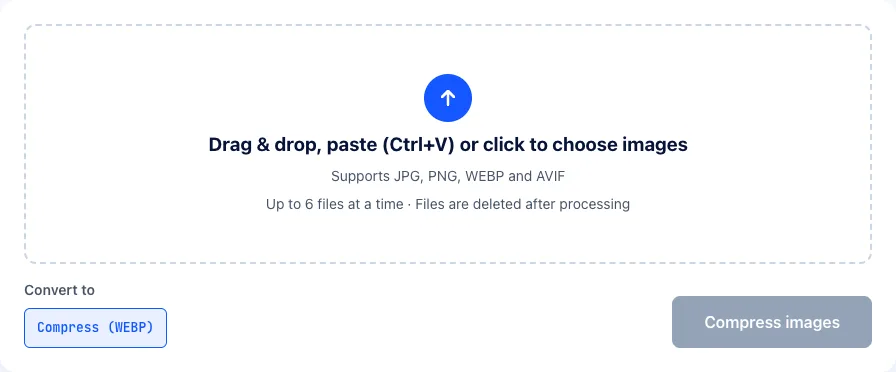
For images on the web, a quality setting of around 75–85 is a good balance: file sizes drop sharply while differences are hard to see. Our image compressor uses WebP at quality 75 with its most thorough compression mode. On a 1000×872 photo, that took a 516 KB JPG down to 82.6 KB.
4. Always set width and height
When an <img> tag has no width and height attributes, the browser doesn't know how much space to reserve, so content jumps down when the image arrives. This raises your Cumulative Layout Shift (CLS) score and is annoying for readers who lose their place or tap the wrong link. Set both attributes to the image's real dimensions; your CSS can still scale it responsively, and the browser will keep the correct aspect ratio.
5. Lazy load images below the fold
Add loading="lazy" to images that aren't visible when the page first loads. The browser then fetches them only as the reader scrolls near them, so the initial page appears sooner and visitors who don't scroll to the bottom don't download images they never see. More in Lazy loading and responsive images.
6. Prioritize the main image
The opposite applies to the largest image in the first screen, such as a hero banner or an article's cover image: it should never be lazy loaded. Add fetchpriority="high" to tell the browser to fetch it as early as possible. This is often the quickest way to improve LCP.
How to measure the results
- PageSpeed Insights (pagespeed.web.dev): enter a URL to get a score and image-related suggestions such as "Properly size images" and "Serve images in next-gen formats".
- Google Search Console → Core Web Vitals: real-world data from Chrome users visiting your site.
- Google's thresholds for a good experience: LCP under 2.5 seconds, CLS under 0.1, and INP under 200 milliseconds.
Frequently asked questions
How small should my images be?
There's no single number, but a practical target is under about 200 KB for a large image at the top of the page and under about 100 KB for images within an article. If an image is still heavier after compressing, its pixel dimensions are usually too large.
Do I need an image optimization plugin?
On WordPress and similar platforms, a plugin that automatically compresses uploads and serves WebP is well worth it if your site has many images. Even with a plugin, resize images to a reasonable size before uploading.
Does a CDN make images faster?
Yes. A CDN serves copies of your images from servers close to each visitor, and many image CDNs can also resize and convert images on the fly. But a CDN doesn't replace starting with sensibly sized, compressed images.
Should I ever use PNG on a website?
Yes, for screenshots, simple graphics and images that need pixel-perfect edges. For logos and icons, SVG is usually better still. For photos, PNG is almost always the wrong choice: in our tests, photos were around seven times larger as PNG than as JPG. See SVG vs PNG and PNG vs JPG.
The bottom line
Right size, modern format, sensible compression, width and height on every image, lazy loading below the fold and priority for the main image. Together these six steps usually shrink a page's images to a fraction of their original weight and noticeably improve Core Web Vitals.